Nitro Next College Comparison Dashboard
Month 2023
I teamed up with another designer and our UX researcher to prototype, animate, and test a dashboard enabling side-by-side college comparison, visual financial breakdowns, and scholarship sourcing.
Tagged: Product design, User testing, Animation


1. Problem
Nitro Next is a browser-based application that allows students and parents to track all of their money for college in one place. Users get matched to personalized scholarships by filling out a quiz, can add and track all sources of money for college (scholarships, loans, grants, and family contributions).
Our internal research showed students and parents in the college selection process use a variety of ad hoc, manual ways to help themselves. Nearly all admitted there’s just no singular go-to tool that assists families in this momentous, time consuming, and stressful decision. Plus, analytics showed a drop off in engagement after initial sign-up. Many users would find a couple scholarships, then not use the app for months. Enter our College Comparison dashboard - an added feature to the existing application intended to solve these problems.
My design partner validated some concepts for this dashboard, where I then stepped in. My contribution was to finalize the UI, behavior, animation, and perform one last validation test so that we had all requirements and user scenarios for development.
2. Goals
Business goals
Improve engagement with Nitro Next members in the form of more frequent log ins and greater number of actions taken per session
Ensure as smooth of a delivery and development process as possible for speed to market
Customer goals
Consolidate the fragmented process of finding money for college. Scholarships, loans, grants, and family contributions—typically scattered across various online tools and spreadsheets— aggregated and stacked up against actual college costs
Design goals
Simplify and organize a usually complicated process
Leverage visual representations to help digest the financial picture
Collaborate with developers during build for a quality design delivery that covers all their questions and user scenarios
3. Design
Dashboard
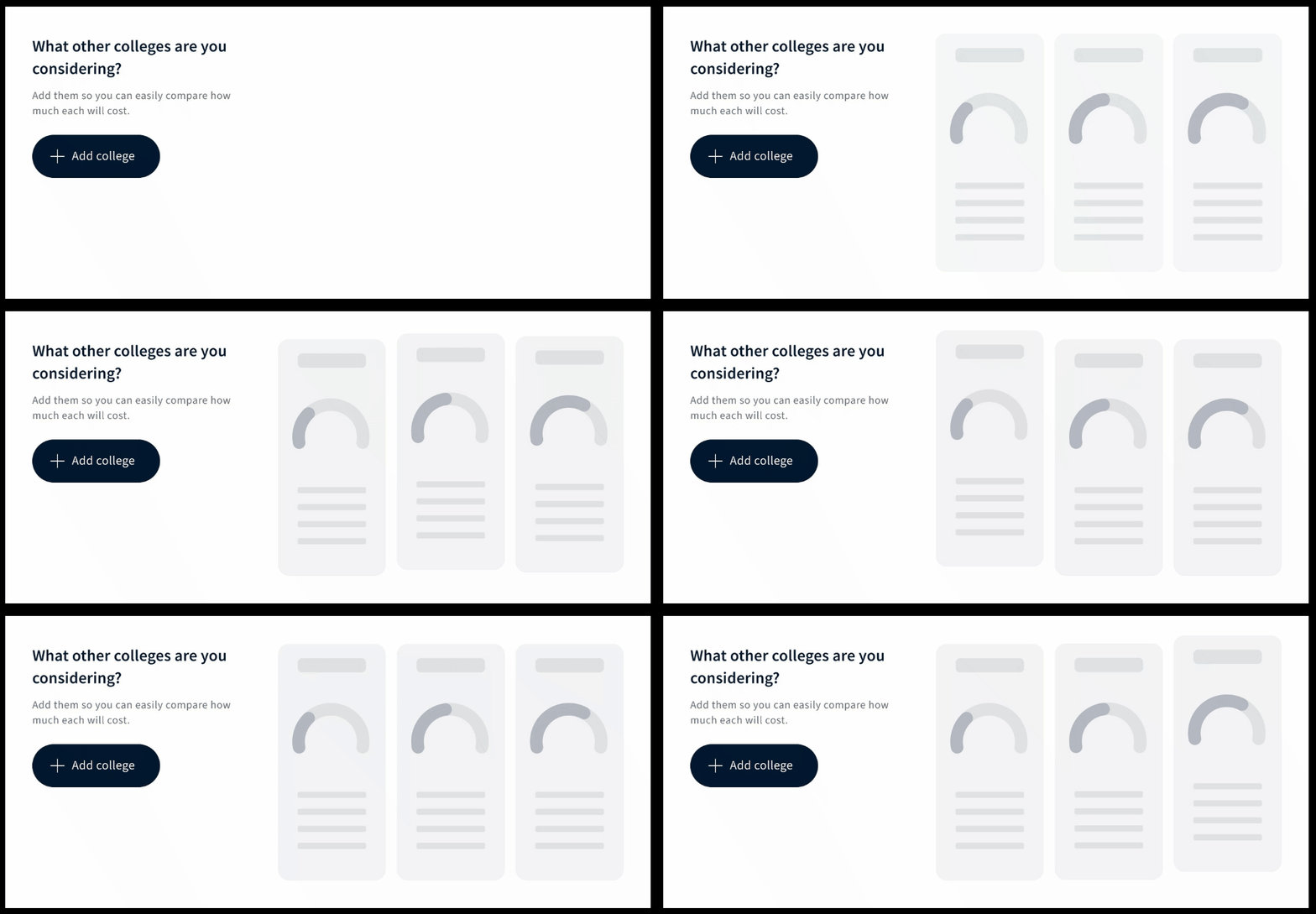
With a validated set of wireframes and components, I finalized the designs in Figma by accounting for all behavioral states, verifying ADA contrast compliance on key information, tidying up components, prototyping, and implementing any last minute developer feedback. This included coming up with an additional “empty state”, with an animation to catch the eye and incentivize the first action in our desired flow: adding colleges.
Animation appears on the dashboard if the user hasn’t added a second college to their list
Selected screens and supporting work
1_Empty state dashboard, initial view
2_Empty state dashboard, expanded view
3_Filled state dashboard, colleges selected
4_College comparison, from colleges selected
College compare interface on mobile (Click to expand)
A peek at requirements documentation and UX finalization for developers
Behind the scenes: frame-by-frame UI animation built in Figma
4. User Testing
In a series of interviews, our research team shared the prototype with our audience cohort of 100 students and parents at varying stages of the college search.
First, they were asked how they’re currently managing the school selection process. Then, they were shown the prototype, exploring all of the features - the college list, the expanded view with cost breakdown, and the college comparison view.
Afterwards, they polled the cohort on how functional they found the dashboard, both quantitatively (rating) and qualitatively (verbal response). Next, the cohort explained what features stood out the most to them and why. Lastly, they shared any questions or concerns.
5. Results
The college cost comparison was the favorite function, with the visual financial breakdown and scholarship sourcing as close seconds. Our new features made the college process very real, by clearly showcasing the true cost of college. The financial side was no longer a "worry about it later" concept - our audience saw real value here.
80% (n=72) of reviewers found the dashboard “very useful”. In addition to the excellent quantitative ratings, users gave verbal feedback as they walked through the prototype. While results were very positive, reviewers also desired more personalization. This could include the ability to add financial variables dependent on the person's situation (e.g. books, housing, food) to ranking preferences, to choosing the the way data is presented (graph vs. pie chart).
Post-release survey results
Overall, 7 out of 10 members would return.
More specifically, 74% of high school students were “very likely:” to return, and 68% of parents of high school students were “very likely” to return.


