Sallie Mae Rebrand & Digital Design System
2023
Sallie Mae underwent a rebranding, an opportunity for us to reimagine the digital brand and design system.
Tagged: Design systems, Typography, Color, Accessibility
1. Problem
Sallie Mae’s digital ecosystem includes a number of platforms and experiences. Plus, the company made two acquisitions in the last two years. At such a scale, our current design system became fragmented and inconsistent.
An initial design system by a hired agency was not responsive, accessible, nor truly meeting the needs of the brief—and ultimately our digital users. We needed to fix the system and help develop “Sallie’s” new brand in digital. My main focus was typography, but I also supported color and component design.
Sallie’s current design system chaos
2. Goals
Alleviate creative chaos and strain on resources
Speak an accessible and unified digital language across our products and channels
Get cross-functional support from and work in true partnership with brand, development, and business
3. Discovery
Our existing data and design system resources set the foundations.
Brand focus group validation
Our internal research team validated the brand team’s new concept moodboards with our audience cohort of 100 students and parents, giving us a base direction to expand upon.
Scoping and needs analysis
Current audit: Many current type and color styles were skipped altogether in day to day, real use contexts. They worked in theory, but not in reality.
Needed greater range of type styles for longform reading, authenticated platforms, and complex UI patterns such as form fields, calculators, and tables.
4. Color
Paired with another designer, I helped brainstorm digital color needs based on brand’s initial palette.
Strong blues made up our primary colors, and energetic, youthful accents supplemented the palette.
We created various tints and shades of the palette to ensure accessibility and UI needs could be met in a flexible, but consistent way.
Throughout, we tested all colors against each other for WCAG contrast accessibility and to identify what colors and combinations might work best as text, background, and accents.
The final brand color palette showing proportional use
Accessibility testing
User testing reactions to a sample page with new color palette
5. Typography
We established an initial set of styles on a modular type scale, then applied them to sample web pages and UIs made with our design system in Figma to see if they actually worked in context.
From that home base, we iterated until styles:
Accommodated needs across platforms, components, and use cases with minimal redundancy and confusion
Demonstrated hierarchy, harmony, and emphasis
The brand team’s new typface Roc Grotesk worked well for display and marketing. We needed to consider additional practical use cases, especially in core products involving complex UI and the display of financial information. We needed a web-friendly workhorse and a readable serif; we added Open Sans and Lora.
Action type styles (buttons, links, navigation)
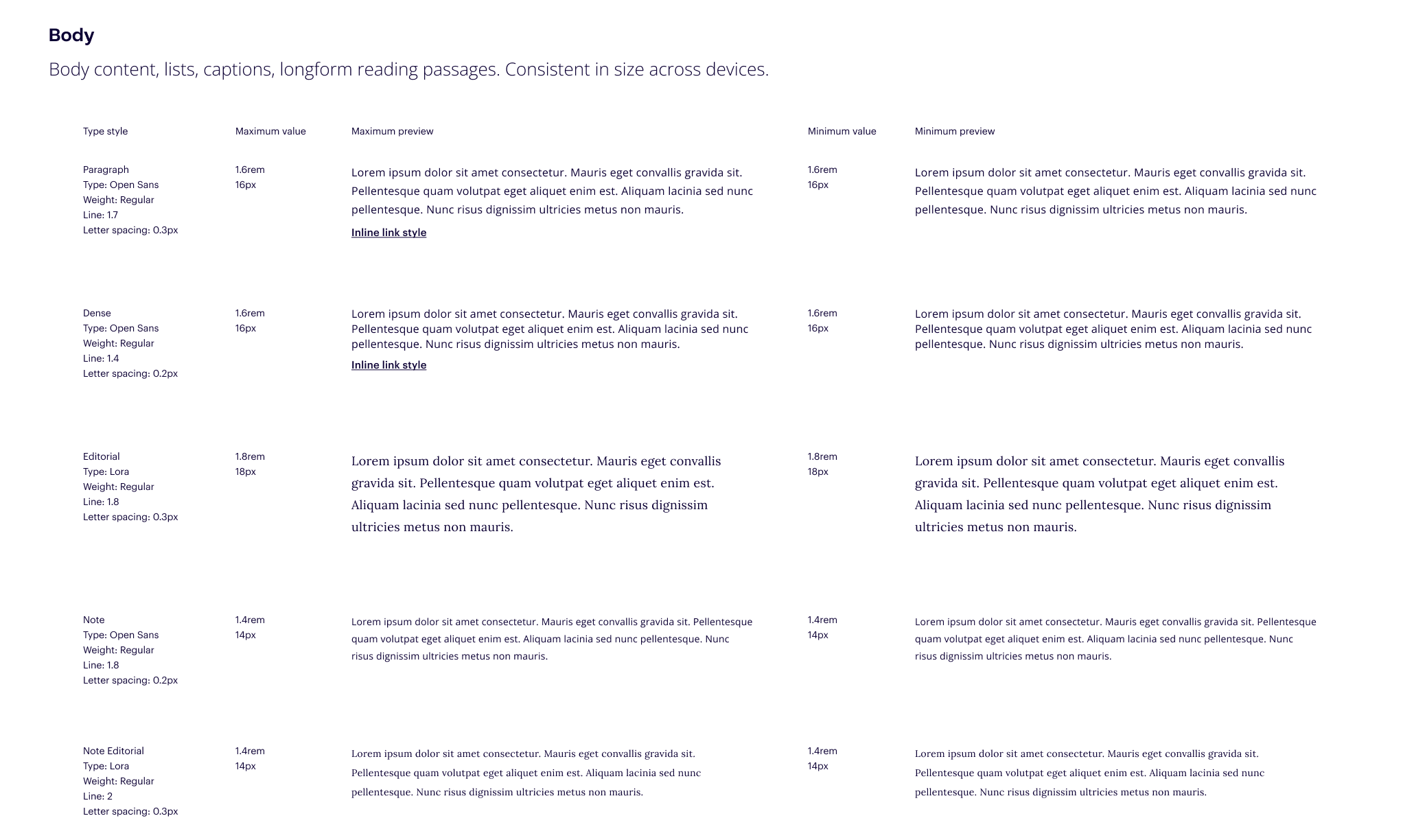
Body type styles (longform paragraph, normal text, blog paragraph, captions)
Display type styles (quotes, large titles, finance rates)
Headline type styles
Peripheral type styles (form field headers, tags, any supporting text)
Delivery
Developer collaboration strengthened design and technology partnership
Made any recommended changes based on their expertise
Documented style usage rules
Established rapport with teams and developer familiarity with Figma
One example of developer specifications we produced during handoff
Results
A solid color and type foundation for Sallie’s" new digital brand, with the blog and website first up in the pipeline
Minimized risk of fragmentation across products
A feedback loop and work flow process with development to enable further evolution, growth, and enhancements
A living, evolving document and singular source of truth that all designers and developers can explore and experiment in
A look at the entire in-progress design system


